
Fascinating piece on the history of the face of Estee Lauder. If you flick through a mag today, what you see, because of photoshop, is a close-up of skin not flawless but not skin at all, a face with only two dimensions.
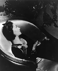
A decision was taken to personify the brand's products in the likeness of this fiction. The campaign would use the same model in its advertising photography over a run of years. Each of the exemplars projected a different kind of physical beauty, though they had much in common. Caucasian women, they are slender but not excessively thin, graced with elegantly long necks, trusty high cheek bones and classically regular facial features. Although a smiling face is thought of as being part and parcel of US product advertising, few of the Lauder lovelies succumb to a parting of the lips. A characteristic expression is of cool don't-mess-with-me reserve.
Consistency was essential in the visuals and this was the responsibility of the Chicago-based photographer Victor Skrebneski, who was assigned to shoot the pictures throughout. In an interview in Town & Country magazine, he said, 'I love to design photographs, to consider the proportions of the figure, the space around it, the edge of the picture.' Among his best-known sitters are Audrey Hepburn, Orson Welles, Vanessa Redgrave, Fred Astaire, and among younger members, Jasmine Guinness.
Owing more than a nod to Hollywood lighting effects and film-still poses, the shoots went flat out for the aspirational. Whether location or studio, a whole slew of fashions in living were called on and called in: impressive houses, designer dresses from the likes of Oscar de la Renta, Halston and Valentino, remarkable accessories and interior design details with an emphasis on collector's level art, both antique and contemporary. In my telephone interview with Skrebneski, he recalled, 'The photographs caused a lot of public comment. People were interested in everything in the picture. The designers whose dresses were shown did quite a lot of business and I was always being asked where we had got hold of an item of decoration.'
Interestingly for such ephemera, the portfolio had an afterlife. It was thought that the pictures communicated more than segments of powder and paint time. A selection of the shots was first published in hardback in 1987 with an introduction by Hubert de Givenchy.
3 comments:
In the 1970s as a young teenager I had a collection of Estee Lauder brochures and adverts pulled from magazines - all now lost. I, for one, will be getting this book if only for the nostalgia value.
When I was a teenager I always thought the Estee Lauder models were styled to look much older than they were--such formal hair and clothes.
The two Estee Lauder misfires, for me, are Elizabeth Hurley and Gwyneth Paltrow. I liked Hurley's original shoot for Pleasures--back when she had a bob, more natural eyebrows, and a bit of flesh. But as she's grown out her hair, plucked, and lost weight, I think she's lost her spark that the company was attracted to in the first place. And Paltrow's photos are just unflattering. I'm so suprised that they were even printed.
I loved the photography of Skrebneski. No other fashion photographer has come close in my opinion.
Post a Comment